Future proofing
Better, faster, smater user experience
Dynamic changes to to fit any device
Built with responsive best practises
Increased sales & traffic
Optimal viewing experience
SEO optimisation
Improved conversion rates
Creating websites with impact
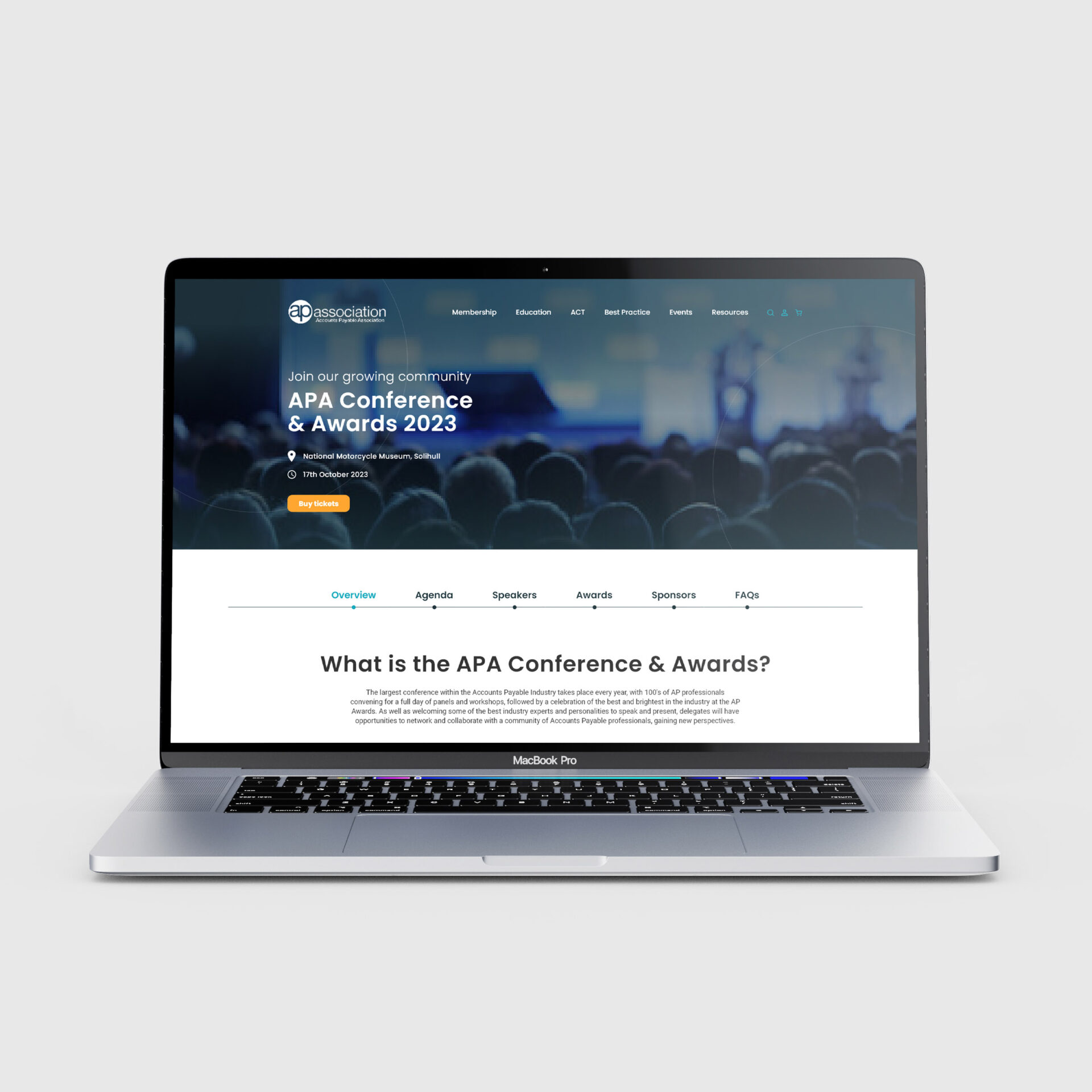
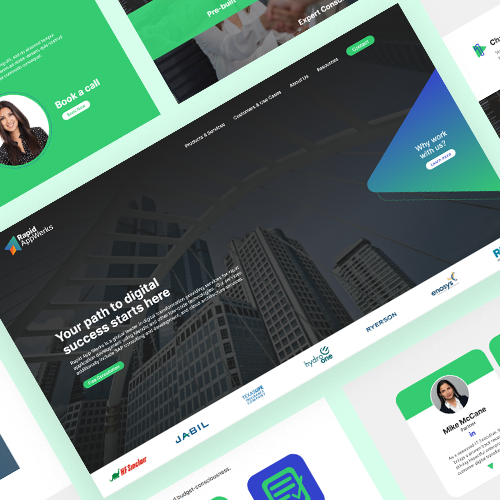
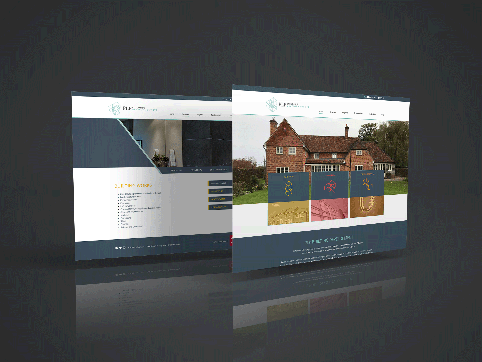
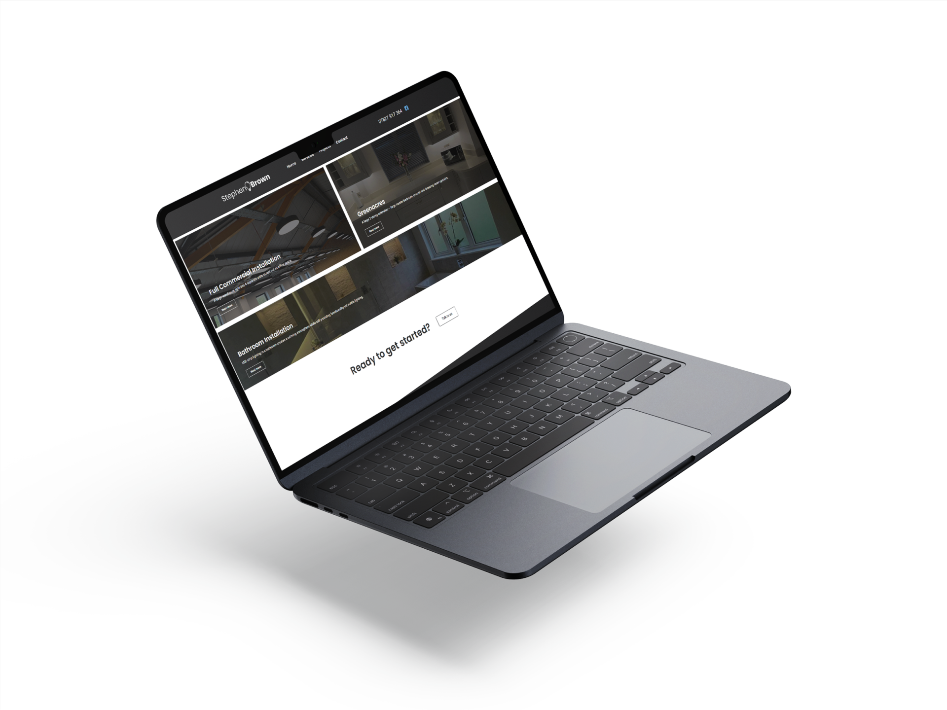
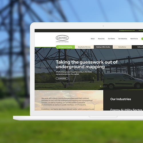
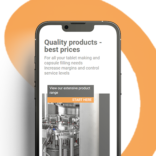
Essentially, the idea behind responsive web design is that one website is created and developed to meet the needs of all devices – whether its a laptop, smartphone or tablet.
Responsive isn’t a trend anymore it’s a must so you are able to expand your reach of your services or products & increase your chances of engagement. Expect more’s design and development process creates a site that provides the optimal viewing experiences seamlessly across all types of device.
You know how annoying it is when trying to browse a normal website on a smart phone when it just doesn’t render properly!
Increased sales & traffic
Responsive websites work out what device your customers are using and then sends them the version of the website with navigation and page layout that works best on that device.
Expect more responsive websites are designed to look great and to work seamlessly, for most sectors not building the flexibility that comes from responsive website design for your site so that it offers a user experience on a mobile device, will mean missing out on significant traffic, and sales.