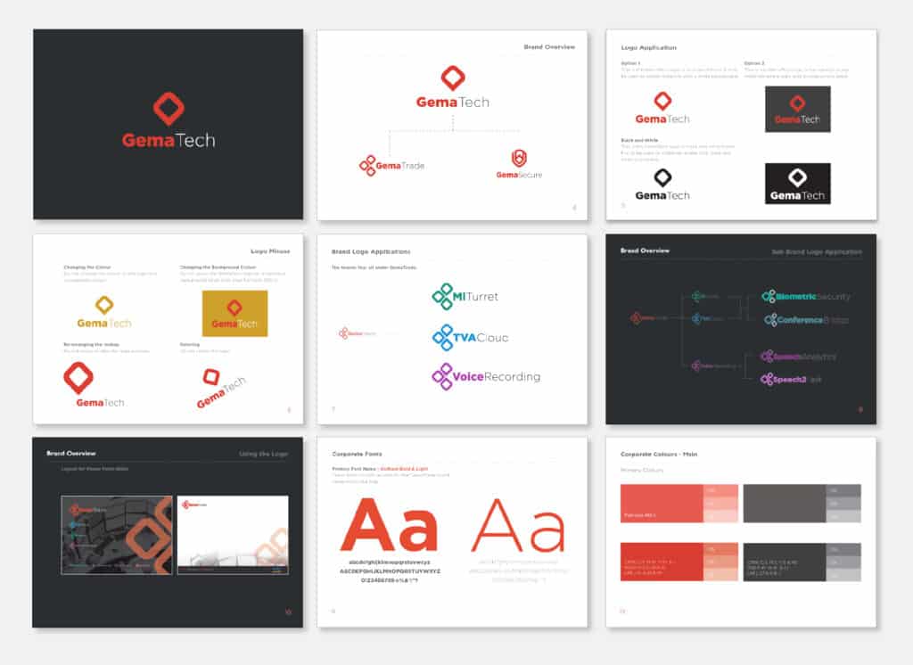
To develop a fresh, evolved brand identity applicable to GemaTech and its affiliated brands, namely GemaSecure and GemaTrade. Additionally, GemaTrade encompasses various distinct internal sub-brands.
Maintaining the primary red and black brand colours, GemaTrade integrated sub-colours for its internal bolt-on services. A graphical icon was introduced to illustrate the three-tier hierarchy of brands, employing the original red and black for the top-level branding, sub-colours for the second level, and a modified graphic for the third level.
Seeking answers to “Who are you?” & “Where are you going?”
the result
Striking yet simple brand recognition through three key visual elements, employing a minimalist colour palette and varying icon sizes to convey distinct significance levels of brand authority. The cohesive branding extended seamlessly across diverse channels, including marketing collateral, business stationery, presentations, exhibition stands, and sales materials.