0
's
Happy Clients
0
's
Successful Projects
0
+
Years of Heritage
the challenge
Locally based Solicitors were looking to update their brand identity and roll this out to a new suite of business stationery and incorporate it into their existing website design. This was to tie in with a relocation to new offices – The exisiting brand was old fashioned but came with a high level of local awareness which the client wanted to retain & extend.

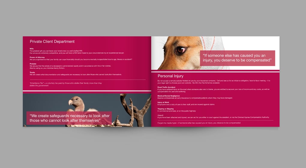
the solution
The strategy was evolution rather than revolution. Updating the font for a more modern feel (san serif) moving away from the more traditional serif typeface – with a change of brand colour from blue to deep strong crimson to retain stability, yet add a more dynamic element & complete the offering with a services brochure.
the result
The new branding was developed across a full suite of business stationery in the new colour scheme and infused into the website. Local outdoor advertising was developed and executed using 96 sheet posters, ad-shell sites, and bus backs exploting the expansion -driven office move to build local awareness even further, the new services brochure was mailed out to existing clients and prospects by partners to build new business relationships and up sell within existing ones.
Looking to expand & grow your local customer base, but unsure where to start?